DROP CAP ALPHABET
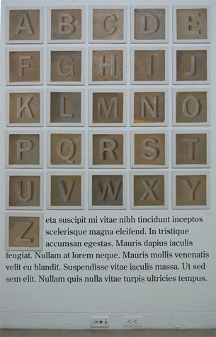
 hat technically distinguishes “lettering” from calligraphy is that lettering is edited and worked over as one would struggle with any sort of drawing. Being trained in traditional drawing and painting, I am interested in the visible struggle over form and color, which, in graphic design, is often obliterated when sketches are digitized.
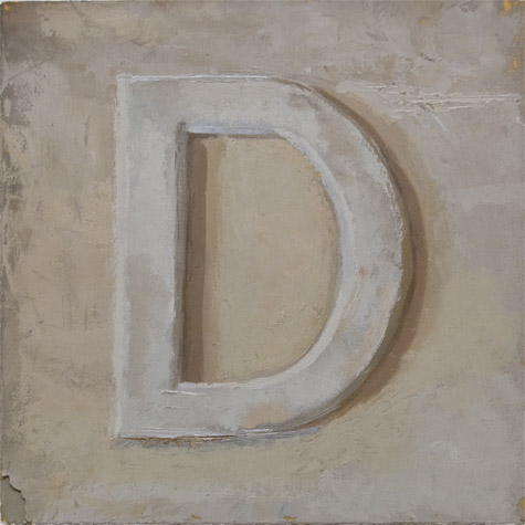
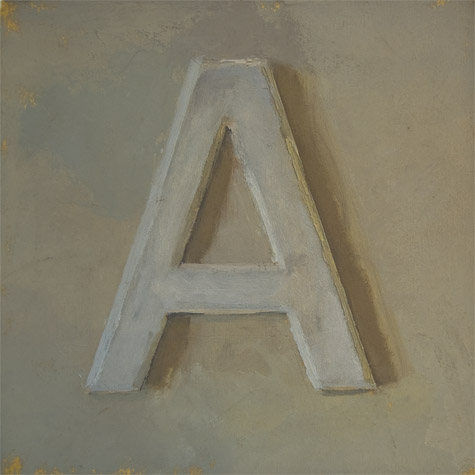
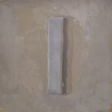
I painted these drop capitals from wooden letters hung on my studio wall in various light and weather conditions. They are available to all in the spirit of Jessica Hische's Daily Drop Cap project.
Copy this code into the beginning of your text, substituting the letter you need for the X in both DropCapX and alt=“X”:
<img src="http://daifoldes.com/images/dropcaps/DropCapX.png" title="Painted Drop Cap by Dai Foldes" align="left" alt="X">
Remember to remove the original text leter you are replacing.
"DAI" LIKE THE OPPOSITE OF NIGHT
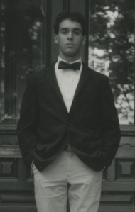
I'm a designer, painter, and recent graduate of the Maryland Institute College of Art living in Baltimore.
My design is informed by art history and the handmade because I was in love with Goya, Hammershøi, and Bellows long before I found affection for Dwiggins or Glaser. Type design and lettering enthrall me more than any other aspect of graphic design and I think it’s because the product is a tool as well as an object of beauty. Type draws on the history of media, eliciting specific, often subconscious responses from readers.
Also, an honest profile of myself would not be complete without mention of my love for cooking. I'm usually thinking about Saturday’s dinner while eating Thursday’s lunch.
FRIENDS
CONTACT ME